Project Overview
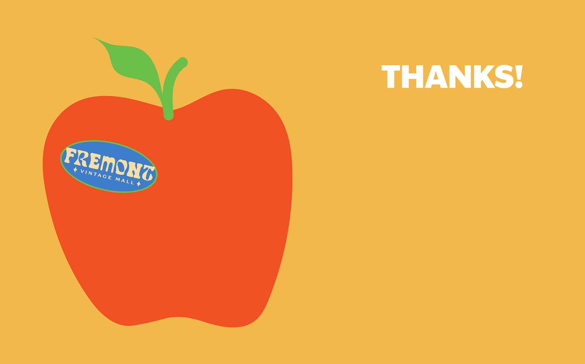
Fremont Vintage Mall needed a modernized brand identity that honored its nostalgic, eclectic charm while communicating its fun, quirky, and curated personality. The updated branding blends bold retro typography with vibrant colors and playful graphic elements, capturing the spirit of treasure hunting that defines the space.
The Problem
How can I rebrand Fremont Vintage Malls identity without losing the beloved chaotic, curated vibe that attracts vintage lovers. How can I create a consistent brand identity over different mediums?
Solution
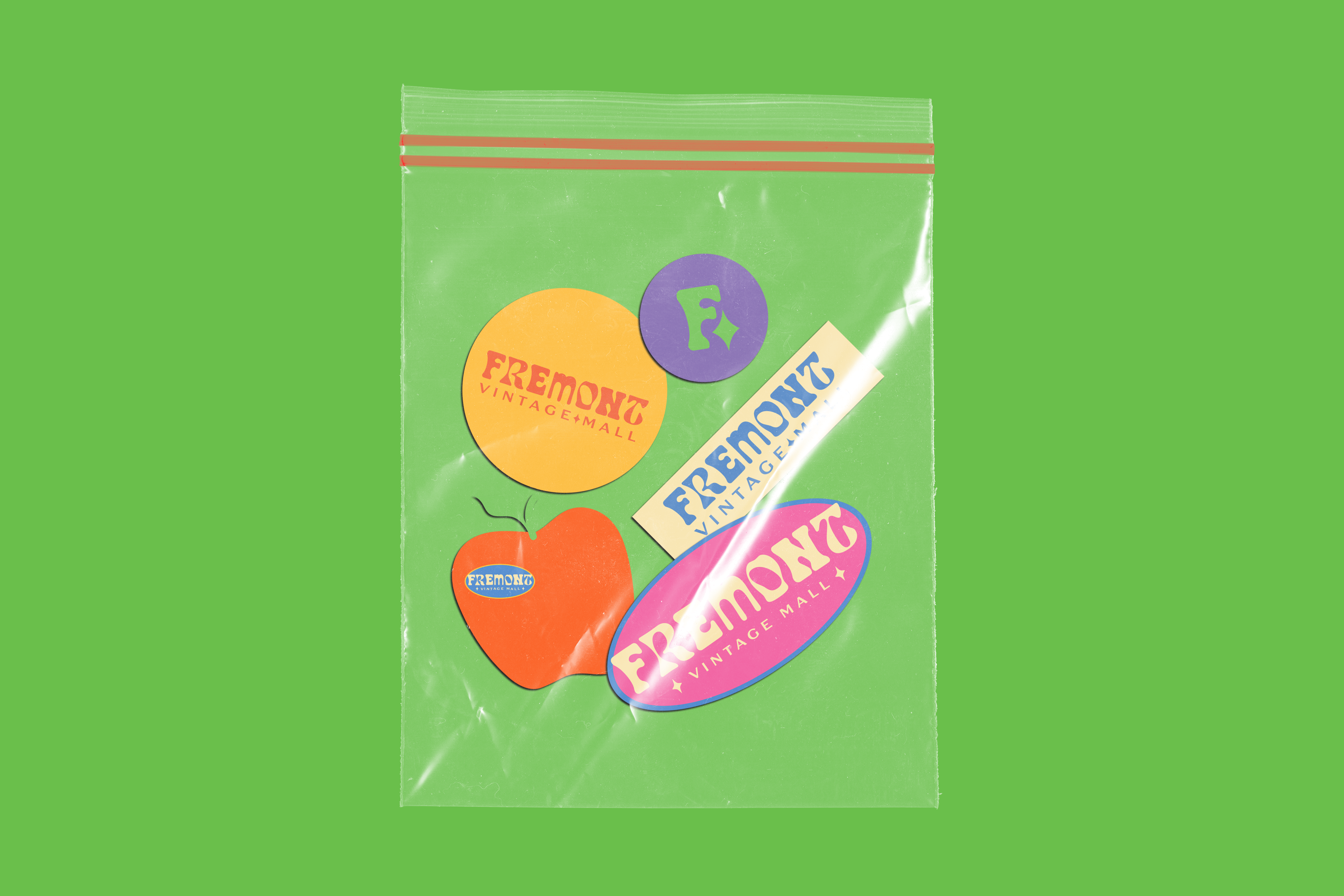
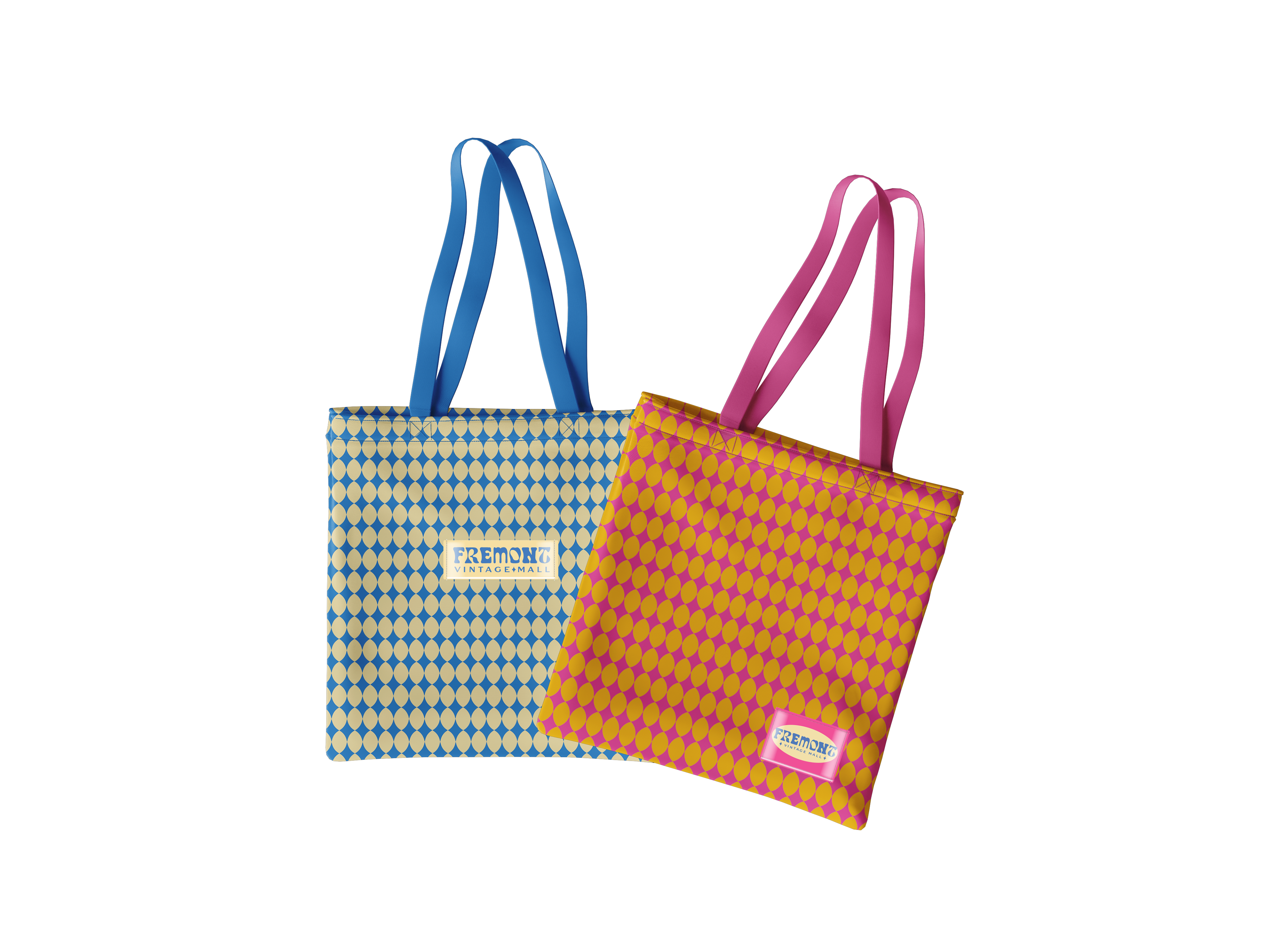
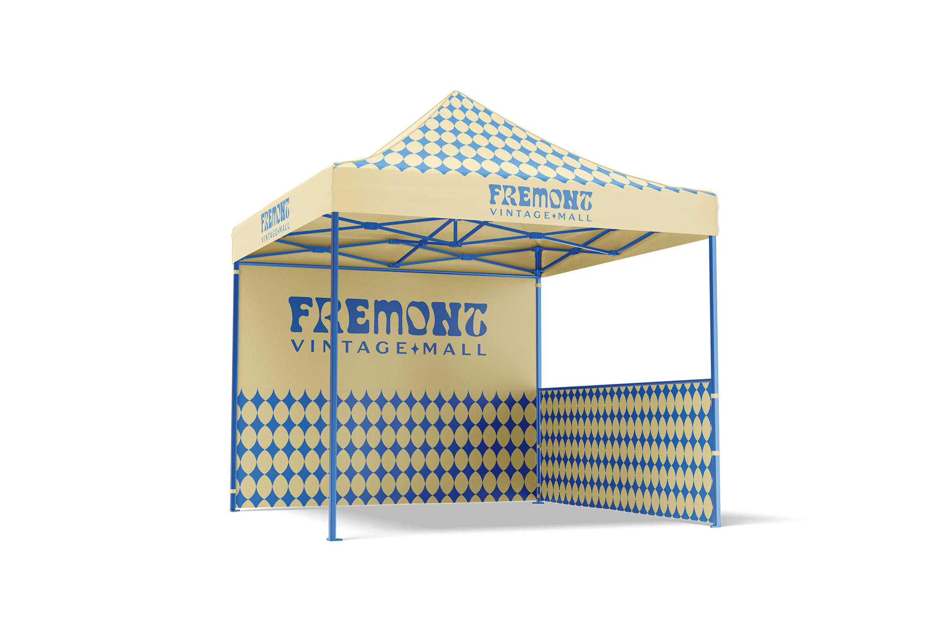
I created a bold, retro-inspired logo system by combining unique typefaces that capture the layered, slightly chaotic charm of the vintage mall. Research revealed that this sense of visual overload and individuality is part of what makes the space so special. Rather than simplifying the identity, I chose to embrace that energy—designing a vibrant, nostalgic color palette and bold environmental graphics that mirror the spirit of exploration and discovery found within the mall.
The resulting brand system is cohesive yet playful, grounded in a visual language that celebrates the eclectic character of the space. From store collateral to a detailed brand book, every element works together to maintain consistency while inviting shoppers to get lost, explore, and stumble upon something unexpected. The identity feels authentic, magnetic, and full of personality—just like the mall itself.
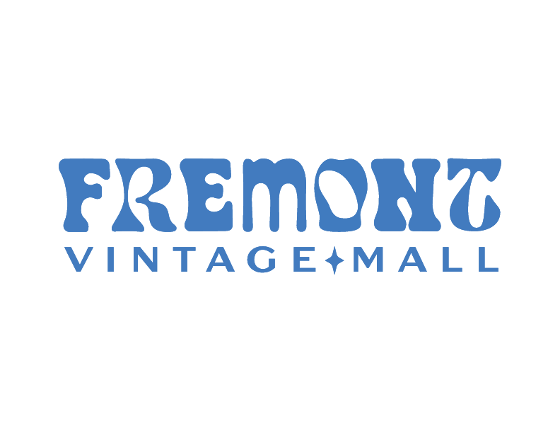
Primary Logo
Stacked Logo

Logo Mark
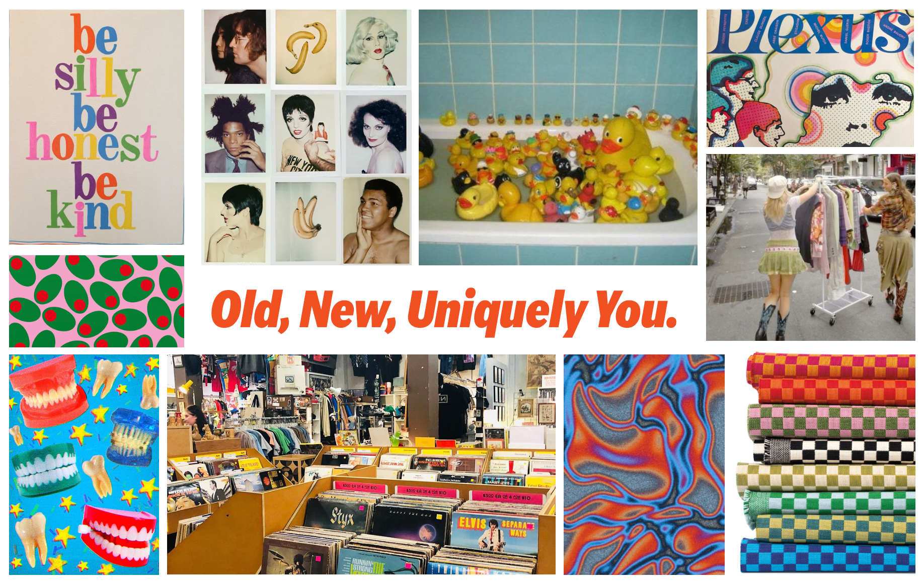
Mood Board + Tagline

Social Media Advertisement Example
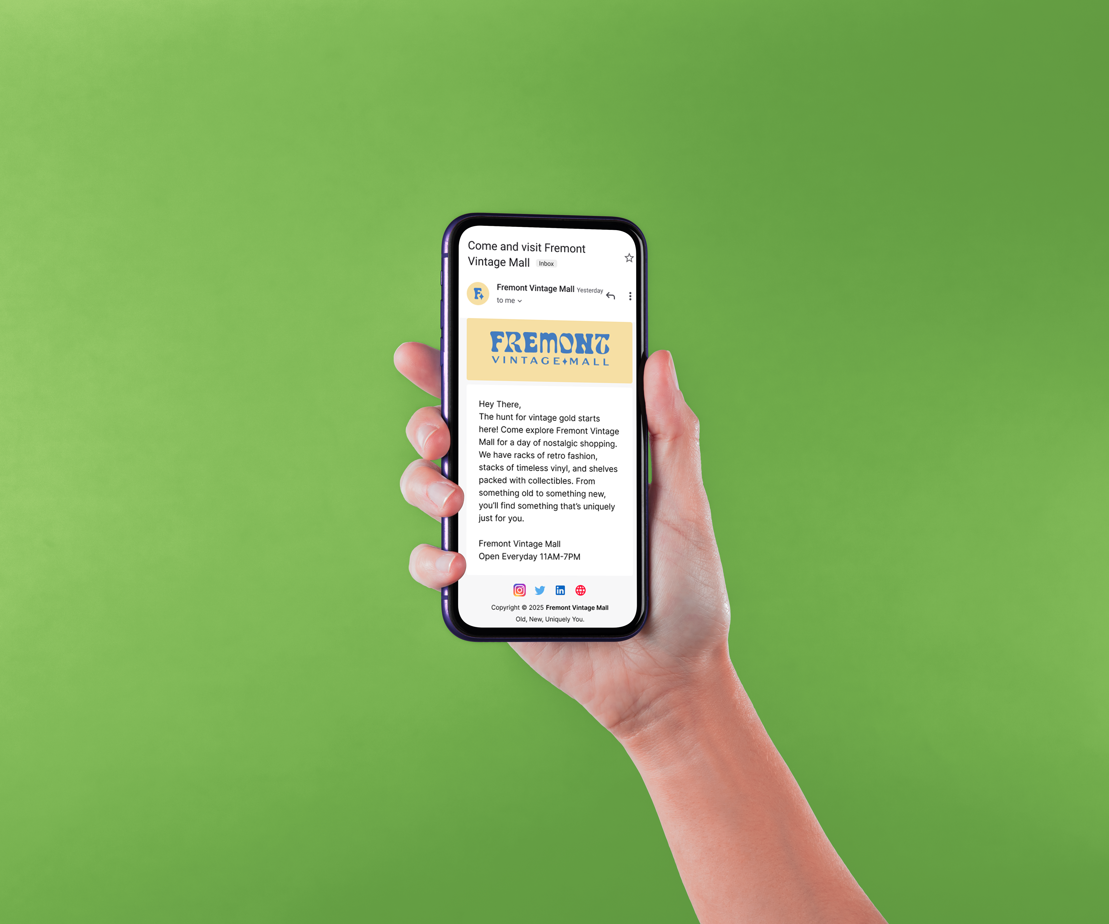
Marketing Email Template Example